
Hitting Refresh
After 28 years under a ‘temporary’ logo, the ACSA takes a big step forward with a new visual identity
by Glenn Cook
The longest journey, to paraphrase an old proverb, begins with a single step. And the Alberta Construction Safety Association took a big step in August with the unveiling of its new visual identity.
At an event on August 12 at the Art Gallery of Alberta, ACSA board members and staff got a sneak peek at the organization’s new logo and branding before it was launched publicly on August 30. And the feedback in the room was overwhelmingly positive.
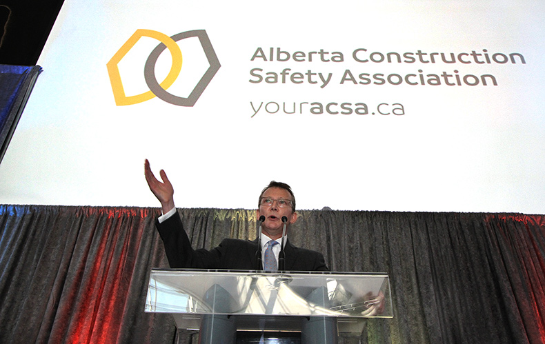
– Stephen King, ACSA board of directors chair
“It was long past time to change the logo we had, understanding that it was to be a temporary logo when it was first released [in 1988]. Every time I drove by the signs on the streets, it just felt old and dated,” said ACSA board of directors chair Stephen King, who works with PCL Construction and represents the Alberta Roadbuilders and Heavy Construction Association on the board. “The new logo, I have to confess, I saw it a month and a half ago, and I love it.”
Michael Hogan, ACSA’s leader in strategy for marketing, communications and reputation, said it represented a “leap forward” for the association.
“Twenty-eight years later, not only have we evolved into something more, but we’re setting ourselves up for the future,” he said. “This wasn’t just about where we are now; this is about where we’re going to be in 10 years’ time.”
The new ACSA logo features two interlocking shapes that can be interpreted in a number of different ways. “We didn’t want to force an interpretation of our brand or who we are onto anyone,” Hogan said. “We wanted our visual identity to be sufficiently interpretive, so that people could put whatever perceptions and whatever feelings on us that they owned.”
“That’s the beauty of it, that it has so much meaning and depth,” King added.
It also includes a standardized colour palette, with two shades of blue and one each of yellow and red, along with a standard set of fonts.
In total, the rebranding took about nine months, a period that Hogan said included lots of hard work, consultations with stakeholders and even a few sleepless nights.
Hogan was quick to share the credit for the new brand with the rest of the communications team at the ACSA, including writer and content specialist Alicia Hewitt and marketing assistant Zahra Elmi.
“There hasn’t been a waking moment [in the past nine months] that the ACSA’s marketing and communications team hasn’t been thinking about this,” he said. “I know that’s a cliché, but it’s true. Zahra and Alicia have just been amazing in their commitment to the work. If it weren’t for the amazing staff at the ACSA, the association wouldn’t have been able to achieve this.”
For Hogan and his team, work will continue on communicating with ACSA members and building a community of safety in the province.
And King believes the new identity will be a catalyst for that communication. “This is going to start the momentum to begin the next phase,” he said. “There’s so much more going on behind the scenes, at the board level, the attitude level. This is the beginning; this is the kickoff. It may look like a big step, but it’s the baby step that gets us started.”